Eva Hesse:
Art as Life
Exhibition Design
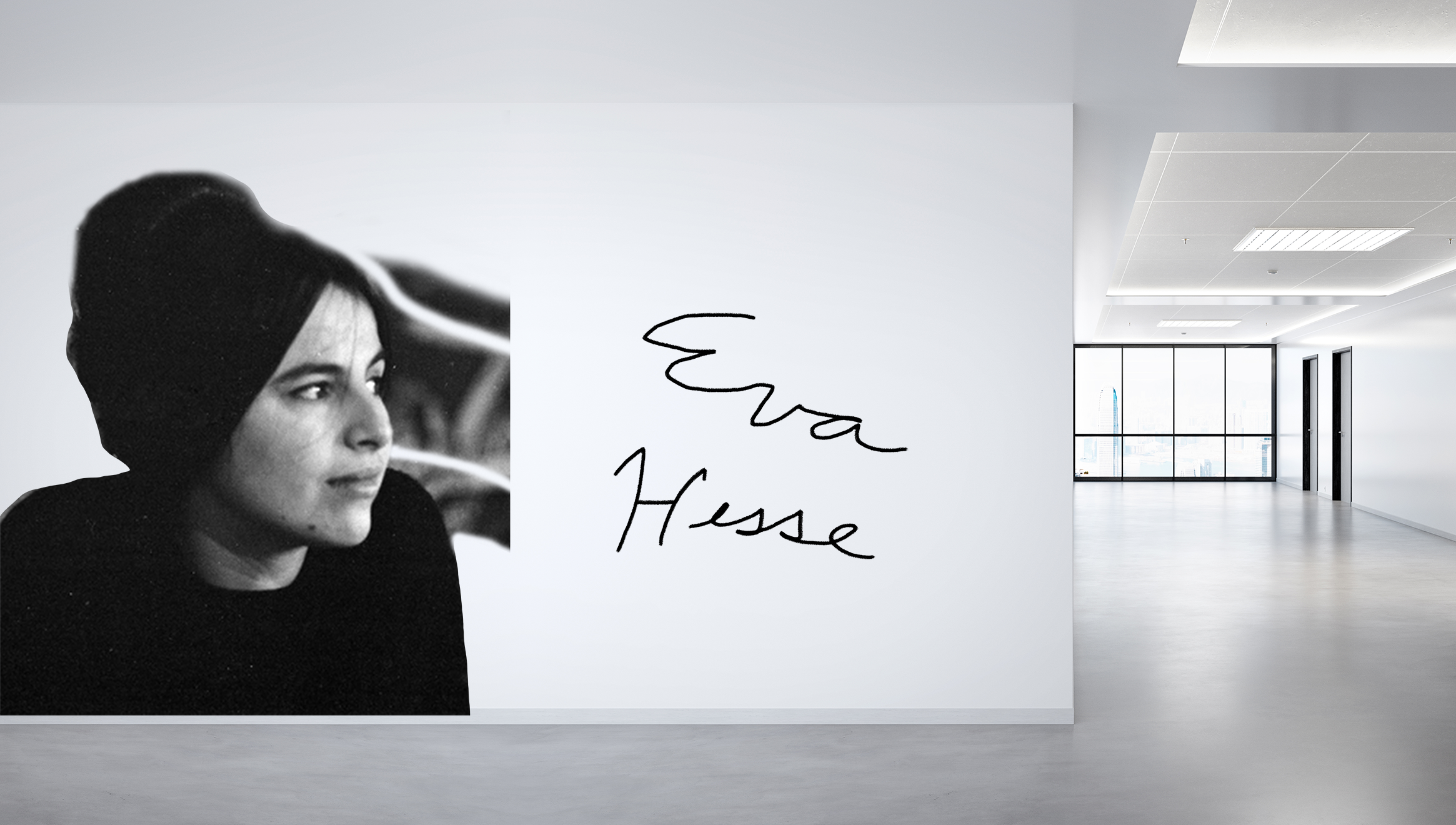
An exhibition dedicated to the amazingly talented Eva Hesse, taking inspiration from Minimalism as a theme and encapsulating those ideas throughout the design.
the catalogue
the wayfinding
research
Step one in this project began with learning about Eva Hesse and her artwork. I wanted her artwork to inform the approach I would take with the design, and I wanted to focus on materials as they were so important in her work.
sketches
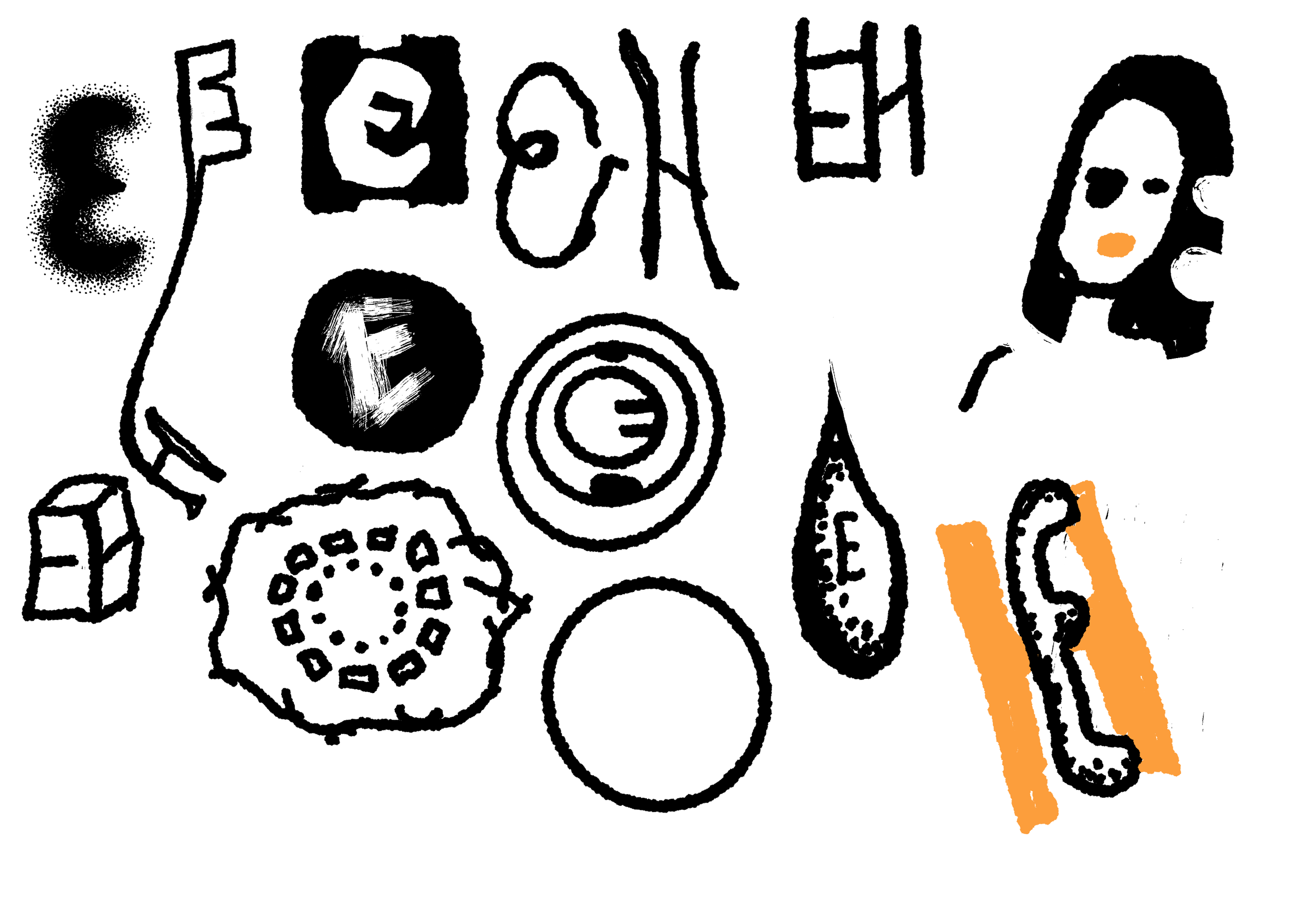
For sketches, I made sure to keep in mind the nature of Eva Hesse’s work and wanted to draw directly from the work itself for many of them. How could this look graphically? Black and white? A bit of color? What shapes are most prevalent in her work? What forms could letters take? These were all questions I pondered while sketching logo ideas.
results
Feedback led me to consider a more poetic approach and a complete return to the idea of the materials informing the logo. So, I decided to push myself and form the letter out of wire, and edit it in Illustrator and Photoshop to create a very soft and poetic logo. The type was chosen to reflect the shapes of the wire.


